Decluttering Navigation: How we Simplified B2B SaaS platform’s Most Used Entry Point
We redesigned JustCall’s global navigation header and profile dropdown to bring clarity, improve interactions, and prioritize what truly matters to our users — sales and support agents who rely on JustCall for their daily communication. This case study walks through the design process, the final solution, and what’s next.
About the product SaaS Labs is a B2B software-company founded in 2016 that builds productivity and communication tools for sales and support teams. Its flagship product, JustCall, is a cloud-based communication platform designed for sales, support and marketing organisations. JustCall allows teams to make, receive, record and analyse phone calls, SMS and faxes directly from CRM or help-desk systems or via web/mobile apps. It is used across more than 70 countries by 6,000 businesses globally. The product’s core customers are sales and customer-support teams in subscription-based, service and technology companies who need a globally-scalable, CRM-connected voice+SMS system.
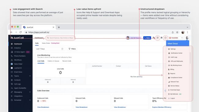
Context The old header included several elements that were rarely used — some almost never. This made the interface cluttered and distracting for agents who needed quick access to their core tools.
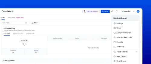
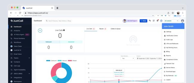
Within the profile dropdown, items weren’t grouped or prioritized based on importance, which added more friction to everyday actions. Beyond UX and visual inconsistencies, there was also an underlying technical issue. The header was originally built in PHP years ago, while the rest of the platform had moved to React. This mismatch was causing performance issues, especially noticeable in load times. Take a look at the image below to see how the old header looked 👇
The previous global header & profile dropdown
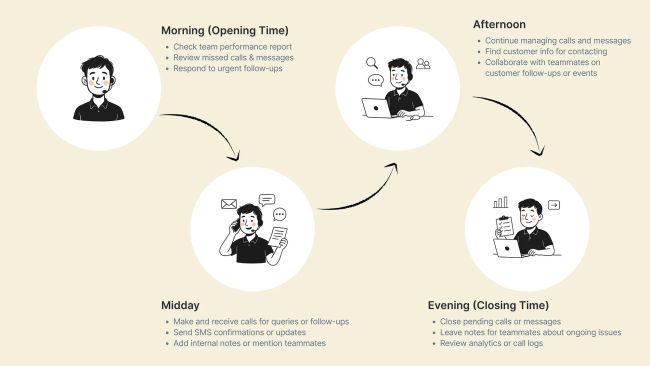
Understanding user behavior To ensure the new global header truly reflected agents’ needs, we conducted brief interviews and usage mapping sessions with JustCall users. Our goal was to understand what a typical day looks like for sales and support agents — the actions they perform most frequently and how often they interact with different elements in the header.
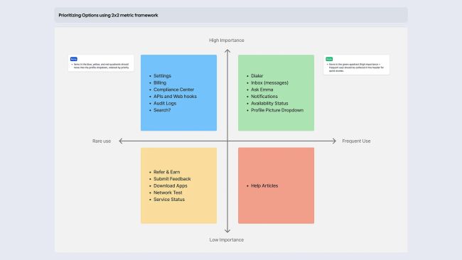
Prioritizing Header Elements Based on Usage & Importance Based on the prioritization framework and user behavior insights, we reorganized header elements to balance visibility, frequency, and importance.
The Redesigned Header Experience The redesigned header brings essential tools to the forefront while keeping the interface visually light, improving daily usability for sales and support teams.
What We Removed from the Main Header — and Why
Search: The global search bar saw very low engagement because users primarily relied on live call support and help articles. Since it wasn’t serving core workflows, it added visual noise without real value. We removed it for now, while keeping space in the design to introduce an AI-powered search experience in the future.
Help & Support: The Help & Support icon opened a menu with three low-frequency actions: viewing help articles, submitting feedback, and checking product updates. These weren’t part of day-to-day workflows and didn’t merit top-level visibility. We relocated them to the Profile menu to reduce clutter and keep the header focused on high-intent tasks.
Download Apps : This link occupied persistent space despite being relevant mostly once during onboarding. Since users rarely need to access it again, we moved it into the Profile dropdown. This freed up valuable header real estate and improved the overall information hierarchy.
Redesigning the Notification Panel We redesigned the notifications panel to make notifications more readable, contextual, and actionable. The old panel displayed every notification in a uniform, text-heavy format. The new design introduces a refined visual hierarchy using iconography, spacing, and grouping so users can immediately distinguish missed calls, low call scores, and follow-up needs. This reduces cognitive load and helps teams react to critical items faster.
Redesigning the Availbility Dropdown
- Limited Status Clarity The earlier dropdown only allowed switching between Available and Unavailable, without explaining what “Unavailable” actually meant for call routing, notifications, or workload distribution. This lack of clarity often made agents hesitant to change their status because they didn’t fully understand the operational impact.
- No Context About Working Hours There was no visibility into how the user’s working hours influenced their availability state. If someone accessed the platform outside their set working hours, the system would quietly mark them unavailable — but there was no clear path for fixing or adjusting this. This resulted in confusion, missed calls, and extra support tickets.
- Missing Granularity & Real-World Reasons Real agent workflows require more nuance (Lunch, Commuting, Outage, Technical Error, etc.). The old version offered no predefined reasons, no consistency in status reporting, and forced teams to depend on chat messages or manual updates to understand why an agent wasn’t receiving calls.
Improvements in the Redesigned Availability Dropdown
Redesigned Availability Dropdown
- Added Clear Explanation via Info Icon A dedicated info tooltip now explains exactly what happens when the user switches to Unavailable. This removes ambiguity and creates trust: users instantly understand how their status affects call routing and visibility across the team.
- Integrated Link to Working Hours We added a “Set Working Hours” touchpoint within the dropdown. This solves a real usability gap:
- If the system marks you unavailable because you are outside working hours, you can now adjust them from the same entry point.
- Reduces confusion and support queries.
- Makes availability more predictable and controllable.
This connection between status and schedule is a subtle but impactful product improvement.
Profile Dropdown Redesign Problems in the Previous Profile Dropdown
- Overloaded and Unorganized Menu The old dropdown contained too many items placed in a single vertical stack, without logical grouping. Critical settings, troubleshooting tools, billing options, and help resources were mixed together, making the menu feel heavy and hard to scan.
- High-frequency vs low-frequency items had equal weight Actions used regularly (e.g., Settings, Billing, Reports) appeared with the same visual weight as rarely used actions (e.g., Service Status, APIs & Webhooks). This reduced discoverability and slowed down navigation for agents and admins.
Redesigned Profile Dropdown
Redesigned Availability Dropdown Prototype
https://www.youtube.com/watch?v=Q9rOs0wN3Dc
- Prioritized High-Frequency Tasks Frequently accessed actions now appear at the top: • Settings • Billing • Compliance Center Low-frequency items were pushed downward or grouped, creating a more intentional hierarchy.
- Introduced a Nested Troubleshoot Section Troubleshooting items were grouped under a dedicated section with a flyout: • Network test • Service status This reduces menu height, keeps rarely used actions tucked away, and still makes them easy to find when needed.
Closing Thoughts This redesign wasn’t just about cleaning up UI components — it was about creating a more predictable, transparent, and agent-friendly experience across JustCall. By refining the Availability dropdown and the Profile menu, we reduced friction in everyday workflows, improved discoverability of essential tools, and established a clearer information architecture that scales with future product growth. These improvements form a foundation for deeper automation, more intelligent routing, and a more cohesive product experience overall.
Read the full article here: https://meetdesaiiii.medium.com/decluttering-navigation-how-we-simplified-b2b-saas-platforms-most-used-entry-point-609ae2169921
