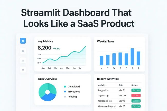
Streamlit Dashboard That Looks Like a SaaS Product
Learn how to transform a simple Streamlit dashboard into a sleek SaaS-style product with real-world code, components, and design tricks.
The Problem with Streamlit Dashboards Let’s be honest: most Streamlit dashboards look like… prototypes.
Great for hackathons. Perfect for internal tools. But when you’re trying to impress investors, users, or clients, a default Streamlit app screams MVP demo instead of SaaS product.
The good news? With the right tricks — styling, layout, components, and polish — you can build a Streamlit app that looks indistinguishable from a modern SaaS dashboard.
The SaaS Look: What Makes It Different? When you think about SaaS dashboards like Notion, Linear, or Figma, certain traits stand out:
- A clean, modern UI with consistent spacing and typography.
- Navigation bars that feel like real apps.
- Interactive charts that look alive.
- User onboarding touches like avatars, login states, and dark mode.
Streamlit gives you the skeleton. You add the muscles and skin.
Step 1: Custom Layout with Columns & Sidebar A SaaS-style app needs structured navigation.
import streamlit as st

st.set_page_config(
    page_title="SaaS Dashboard",
    page_icon="📊",
    layout="wide"
)
# Sidebar navigation
st.sidebar.title("📂 Navigation")
page = st.sidebar.radio("Go to", ["Overview", "Analytics", "Settings"])
# Top header
st.markdown(
    """
    <style>
        .main-header {
            font-size:32px !important;
            font-weight:600;
            padding-bottom:10px;
            border-bottom: 1px solid #eee;
        }
    </style>
    """, unsafe_allow_html=True
)
st.markdown('<p class="main-header">🚀 SaaS Dashboard</p>', unsafe_allow_html=True)
👉 Now you have:
- A wide layout that feels like a modern app.
- A sidebar navigation for multiple sections.
- A styled header that looks like a SaaS brand.
Step 2: Adding Interactive Charts Nobody trusts a SaaS dashboard without charts. Use Plotly for interactive, SaaS-grade visuals.
import plotly.express as px
import pandas as pd

df = pd.DataFrame({
    "Month": ["Jan", "Feb", "Mar", "Apr", "May"],
    "Revenue": [1200, 1800, 2500, 3000, 4000]
})
fig = px.line(df, x="Month", y="Revenue", markers=True, title="Monthly Revenue")
fig.update_layout(template="plotly_white", height=400)
st.plotly_chart(fig, use_container_width=True)
This immediately feels “SaaS-y”: smooth, interactive, and polished.
Step 3: Cards for Metrics (KPIs) Every SaaS dashboard highlights key numbers in cards.
col1, col2, col3 = st.columns(3)

with col1:
    st.metric("Active Users", "1,245", "+12%")
with col2:
    st.metric("Monthly Revenue", "$4,000", "+25%")
with col3:
    st.metric("Churn Rate", "3.2%", "-0.4%")
👉 These KPI cards mimic dashboards from Stripe, Mixpanel, or Linear.
Step 4: User Profiles and Auth-Like Feel Even if you don’t add real authentication yet, you can mock it.
from PIL import Image

# Fake user session
user = {"name": "Jane Doe", "avatar": "https://i.pravatar.cc/100"}
st.sidebar.image(user["avatar"], width=60)
st.sidebar.write(f"Welcome, **{user['name']}** 👋")
Suddenly, your app feels personalized.
Step 5: Dark Mode & Theming Streamlit supports themes via config.toml. Add this to your .streamlit/config.toml:
[theme]
base="dark"
primaryColor="#4ADE80"
backgroundColor="#0f172a"
secondaryBackgroundColor="#1e293b"
textColor="#f8fafc"
Now you’ve got a dark SaaS feel, like GitHub or Linear.
Step 6: Tables That Don’t Look Like CSV Dumps Replace plain st.table with AgGrid.
from st_aggrid import AgGrid, GridOptionsBuilder


data = pd.DataFrame({
    "User": ["Alice", "Bob", "Charlie"],
    "Plan": ["Free", "Pro", "Enterprise"],
    "Status": ["Active", "Inactive", "Active"]
})
gb = GridOptionsBuilder.from_dataframe(data)
gb.configure_pagination(paginationAutoPageSize=True)
gb.configure_default_column(editable=True, groupable=True)
grid_options = gb.build()
AgGrid(data, gridOptions=grid_options, theme="streamlit")
Now your tables have filters, pagination, and editing — like Airtable.
Step 7: Real SaaS Features (Export & Download) No SaaS app is complete without exports.
csv = df.to_csv(index=False).encode("utf-8")

st.download_button(
    label="📥 Download Revenue Data",
    data=csv,
    file_name="revenue.csv",
    mime="text/csv",
)
Small touches like this scream professional product.
Full SaaS-Style Dashboard Example Here’s everything combined:
import streamlit as st
import pandas as pd
import plotly.express as px
from st_aggrid import AgGrid, GridOptionsBuilder

st.set_page_config(page_title="SaaS Dashboard", page_icon="📊", layout="wide")
# Sidebar
st.sidebar.title("📂 Navigation")
page = st.sidebar.radio("Go to", ["Overview", "Analytics", "Settings"])
st.sidebar.image("https://i.pravatar.cc/100", width=60)
st.sidebar.write("Welcome, **Jane Doe** 👋")
st.markdown("## 🚀 SaaS Dashboard")
# KPIs
col1, col2, col3 = st.columns(3)
col1.metric("Active Users", "1,245", "+12%")
col2.metric("Monthly Revenue", "$4,000", "+25%")
col3.metric("Churn Rate", "3.2%", "-0.4%")
# Chart
df = pd.DataFrame({"Month": ["Jan","Feb","Mar","Apr","May"], "Revenue": [1200,1800,2500,3000,4000]})
fig = px.line(df, x="Month", y="Revenue", markers=True, title="Monthly Revenue")
st.plotly_chart(fig, use_container_width=True)
# Table
data = pd.DataFrame({"User": ["Alice","Bob","Charlie"], "Plan": ["Free","Pro","Enterprise"], "Status": ["Active","Inactive","Active"]})
gb = GridOptionsBuilder.from_dataframe(data)
gb.configure_pagination(paginationAutoPageSize=True)
grid_options = gb.build()
st.write("### 👥 Users")
AgGrid(data, gridOptions=grid_options, theme="streamlit")
# Export
csv = df.to_csv(index=False).encode("utf-8")
st.download_button("📥 Download Revenue Data", data=csv, file_name="revenue.csv", mime="text/csv")
Run this, and you’ll see something that feels more SaaS than Streamlit demo.
Final Thoughts Streamlit’s magic is its speed — you can go from idea to prototype in hours. But with the right tweaks, you can also make it look like a real SaaS product.
- Use navigation and theming.
- Add charts and KPI cards.
- Integrate tables, exports, and profiles.
- Polish with dark mode and styling.
👉 Next time someone tells you “Streamlit is just for prototypes,” show them your SaaS-style dashboard.
Read the full article here: https://medium.com/@hadiyolworld007/streamlit-dashboard-that-looks-like-a-saas-product-05646a72a242
